Context
Fall 2023
Solo project
My Role
User Research, user testing, wire framing, prototyping, data analysis, UI design
Tools
Figma,
Illustrator
DISCOVERY
Seoul holds most of the country's population and resources. But how much are other regions left behind?
Population and resources have long been concentrated in the capital, widening the gap with other regions. People know how dense and developed Seoul is, but few understand how other regions compare. It made me wonder, if the imbalance is so clear, why do so few people understand its full extent?
RESEARCH
What makes it hard for people to see the full picture?
To find out, I conducted user surveys with a wide range of participants — both those living in Seoul and those from other regions. The main insights were:
Fragmented information
Data and stories about regional differences exist, but they are scattered across multiple sources, making it hard to see the overall context.
Attention stays on Seoul
Public discussion often highlights Seoul's over concentration, yet how much other regions are struggling remains largely unseen.
What are the main areas that drive this concentration?
Through secondary research, I identified three main factors driving the imbalance. Capital concentration is a chain reaction. Economic opportunities attract people, and as populations grow, cultural activities expand, drawing even more people into the capital.
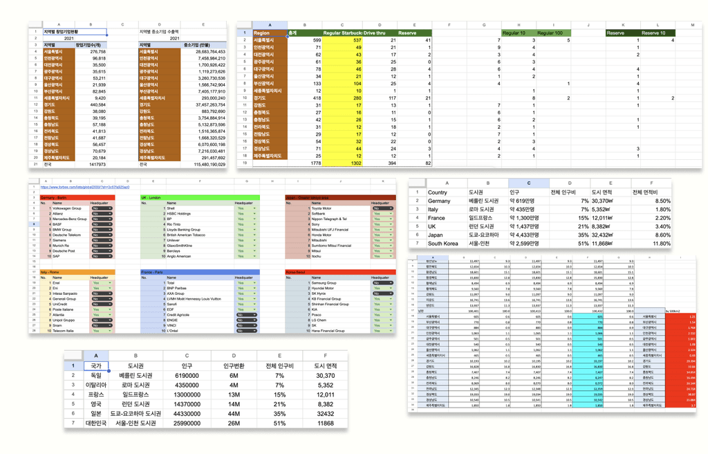
Turning data into design insights
Data was collected from the Korean Statistical Service and other public sources. Data covers 2015 to 2024 and was organized into comparable regional metrics for visualization. These findings set the foundation for exploring how to visualize the imbalance clearly and intuitively.
CONCEPTUALIZATION
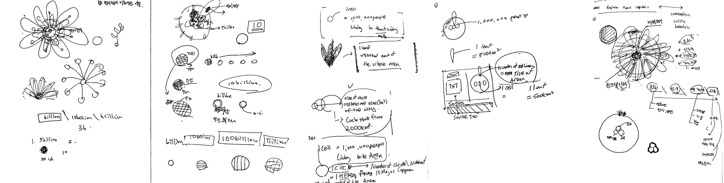
The Hive Effect: Drawing parallels between human migration and bee behaviour
With the data organized, I began conceptualizing how to visualize it. I noticed how the behaviour of bees leaving their hives to seek areas rich in flowers mirrored human movement patterns, which inspired the design metaphor of beehives and flowers throughout the visualization.


DESIGN
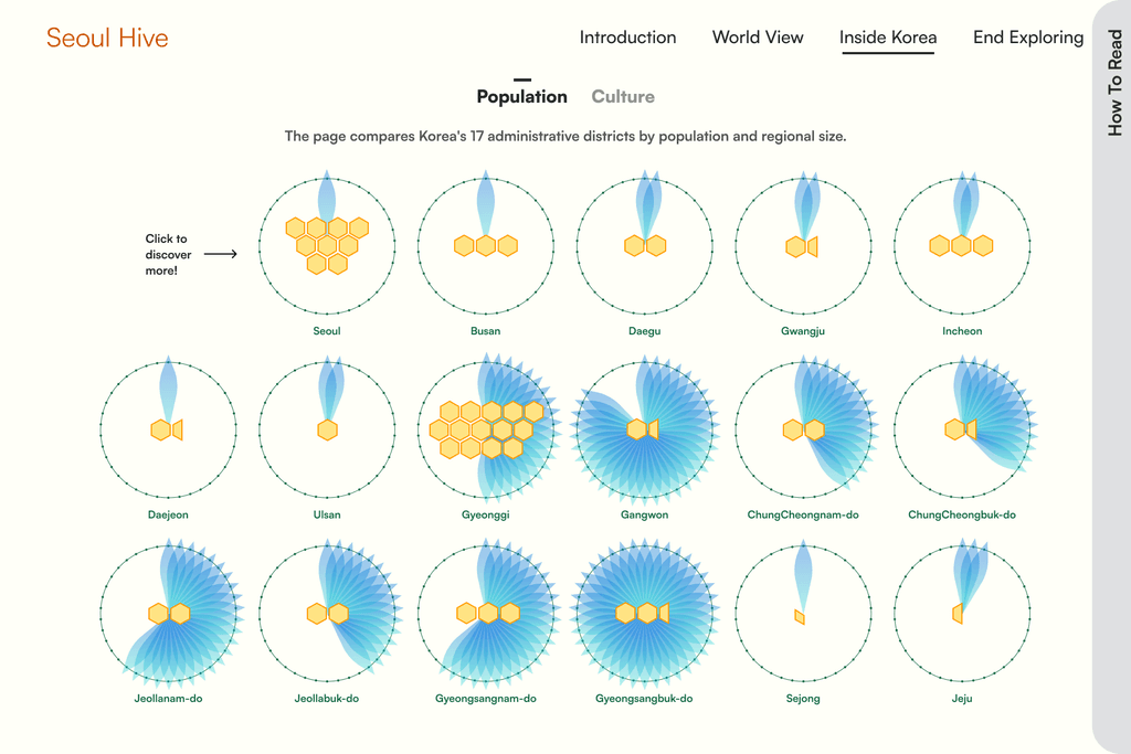
All region in one view
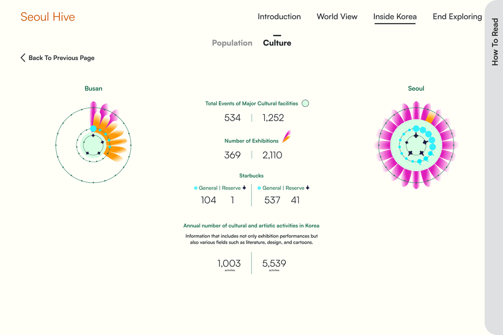
On a single screen, users can explore every region starting from Seoul, viewing data across both cultural and regional dimensions. Instead of focusing only on the capital, the design allows users to compare Seoul with other regions side by side.
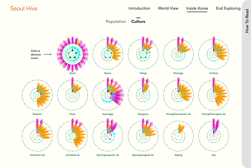
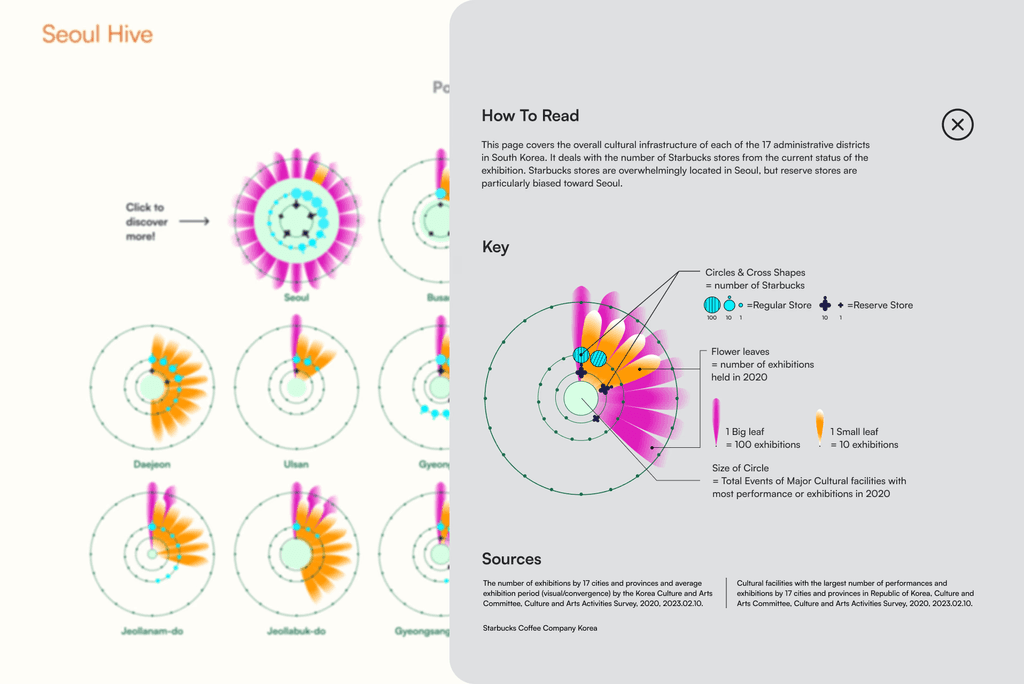
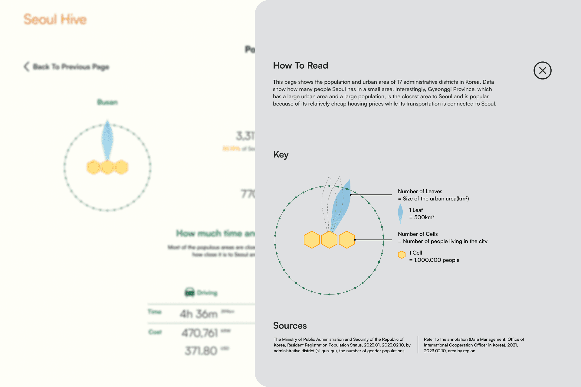
Detailed legends
A “How to Read” panel slides in from the side when selected on the Population and Culture screens. This keeps the main view clean and visually focused, allowing users to access guidance only when needed.
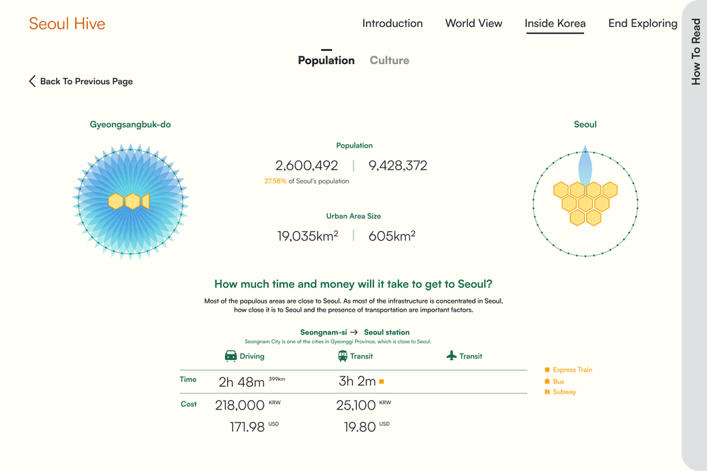
Further exploration page
While the overview provides a simple snapshot, the detailed pages reveal deeper insights — showing gaps in areas like transportation access and cultural life, which are major issues linked to capital concentration.
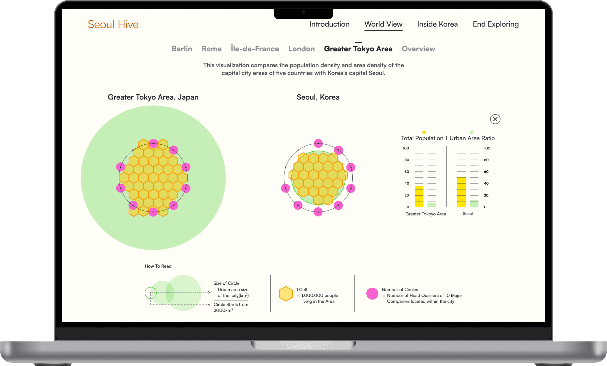
Comparing Capital Concentration Across Countries
I added a view comparing capital region concentration across countries, showing each capital’s area, population, and major company presence to reveal how economic activity clusters around them.
DESIGN EXPLORATIONS
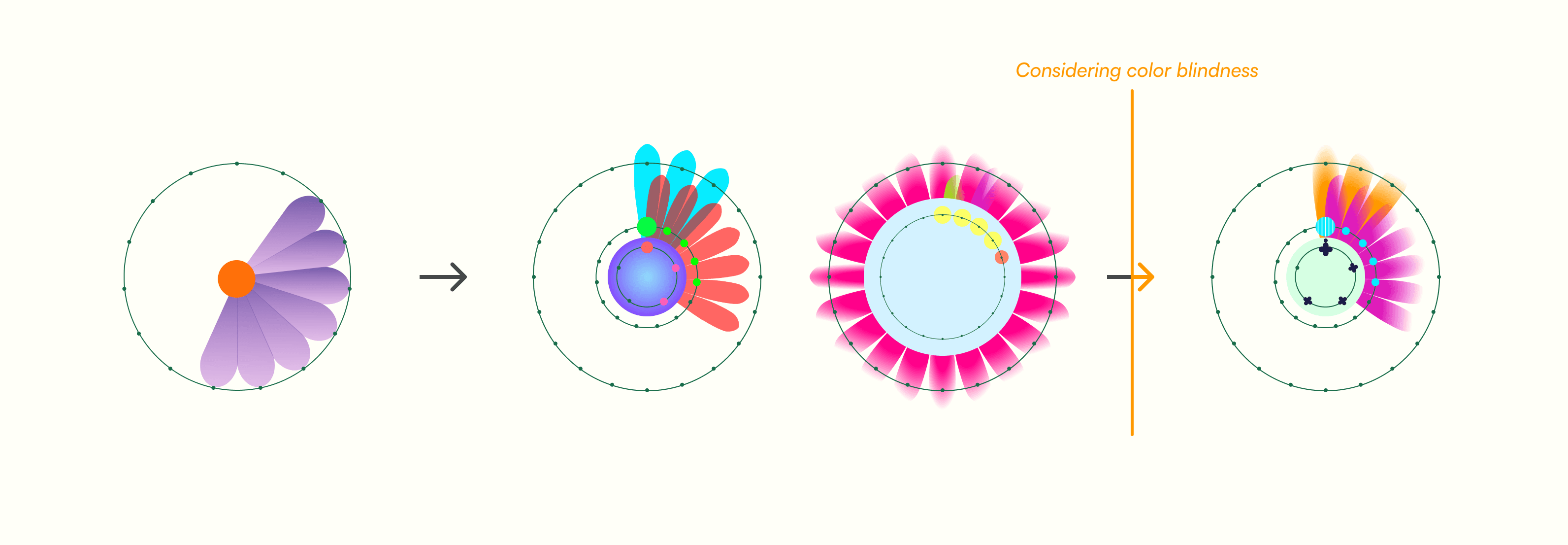
Accessible color design
Combined color with patterns and shapes to improve differentiation.
Tuned contrast and saturation for clarity and balance.
Ensured key differences remain distinguishable even for users with color blindness.

REFLECTION
Takeaways
This project deepened my interest in data design and taught me how to present complex information clearly. It also reminded me how crucial color choice and accessibility are in visualization.
Though I couldn’t include all the details I planned, I hope to refine and expand it further. If I had more time, I would:
Add education informations
Education plays a major role in where people choose to live in South Korea. As academic competition intensifies, more people cluster around areas with stronger schools. It’s a topic I’d like to explore further in the future.
Improving motion
In many data-driven projects, motion plays a key role in shaping the experience — how graphs unfold, respond, and move on hover interactions. I’d like to improve in this area to create more dynamic and engaging visualizations in the future.